Color Theory #
History #
Color theory has been around since the Greeks, through the Renaissance, and is evolving today as we kick off the digital age.
Leon Battista Alberti (1404-1472) #
Alberti was a Renaissance man but now is remembered mainly for his art and architecture.
His thoughts on color theory?
“Through the mixing of colours infinite other colours are born, but there are only four true colours – as there are four elements. – Red is the colour of fire, blue of the air, green of the water, and of the earth grey and ash.”
He did not consider white and black to be actual colors, just modifiers for other colors.
Leonardo Da Vinci (1452-1519) #
Da Vinci was also a renaissance man best known for his art, like the Mona Lisa. But he also was a scientist and inventor far ahead of his time.
His thoughts on color theory?
He brought the theory of having three primary colors but connected them to the elements as before. White represented light, and black being darkness. He used these theories to create balanced compositions.
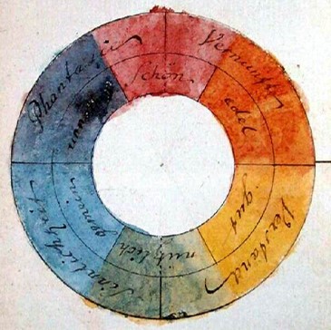
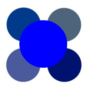
Color Wheel #
The color wheel is a common way to view colors, and for composition purposes, makes the most sense. When you want to make a color palette, how can we pick the best scheme? But also, you’ve heard of RGB and CMYK, so where does that fit into the spectrum of color?
This is the most basic idea of a color wheel. The primary colors mix with one another to create the secondary colors. While there are other versions of how colors “mix” this way predates digital color concepts.
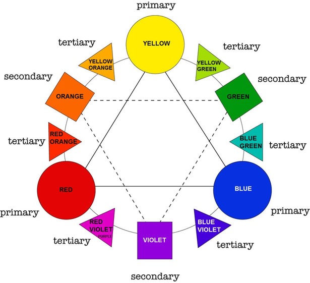
Concepts like the ones shown in this picture can help us to create a color palette. Do we want a simple or complex design? Is this supposed to be something that stands out, or will it be easy on the eyes?
What about RGB? CMYK? #
These are modern terms.
RGB #
- Additive, screens
- Originated with photography, 1860
- Then with CRT (Cathode-ray tube) displays, 1938
CMYK #
- Subtractive, printing
- Started as four-color wet process inks by The Eagle Printing Ink Company, 1906
CMYK Explained (YouTube Video)
Variations of Hues #
The term “warm blue” or a “cool red” sounds like an oxymoron, but it’s not. The terminology can be confusing, but once you see the application, things become a lot clearer.
A hue means something different from tints, tones, and shades.
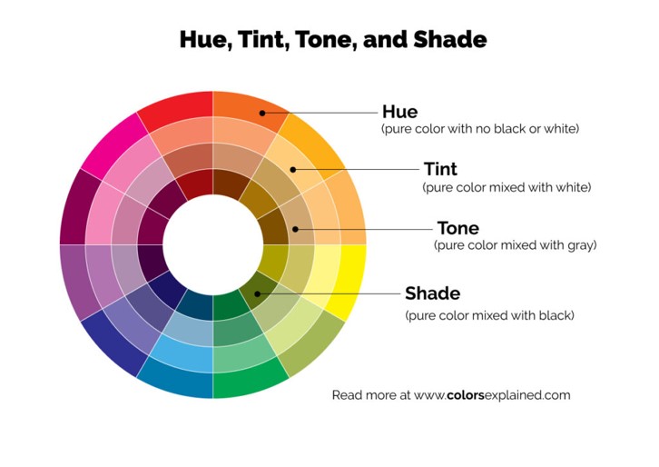
What is a hue? #
The pure color that we start with. Hues are the primary and secondary colors and anything in between. A hue plus a hue is still a hue.
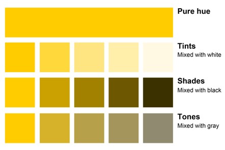
Tint #
- White + Hue = Tint
- Tint + Black = Tone
Shade #
- Black + Hue = Shade
- Shade + White = Tone
Tone #
- Gray + hue = Tone
What about black and white? #
That question elicits an entire tangent presentation however,
- Black is technically the absence of light
- White is pure light
“Some consider white to be a color, because white light comprises all hues on the visible light spectrum. And many do consider black to be a color, because you combine other pigments to create it on paper. But in a technical sense, black and white are not colors, they’re shades. They augment colors.”
Warm vs Cool #
This model is (likely) what we think of when we think of warm vs cool colors.
However, it’s not as simple.
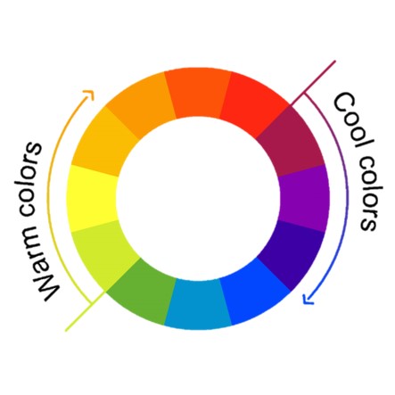
We can think of colors being warm or cool based on their associations, the feelings they invoke, what they mean to us based on what we know.
However, any color can be warm or cool, i.e., a cool orange, a warm green, a cool purple, etc.


With this logic, a primary color, or a perfectly proportioned secondary color is inherently neutral.
With the addition of its neighboring color, the color changes from neutral.
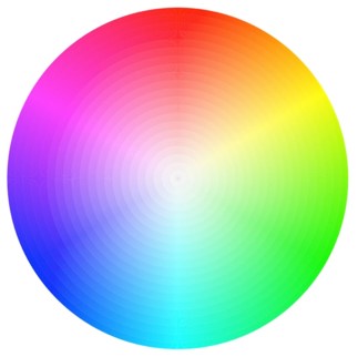

 (The warm hues are on the left, and the cool hues are on the right of the neutral center circles)
Application #
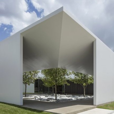
Minimalism #
Brands are becoming more minimalist, sleek, black and white. Simplifying everything from logos to architecture has been the trend. Color becomes even more important when edges are cleaner, lines are simpler, and more things are gray scale.


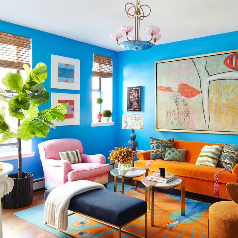
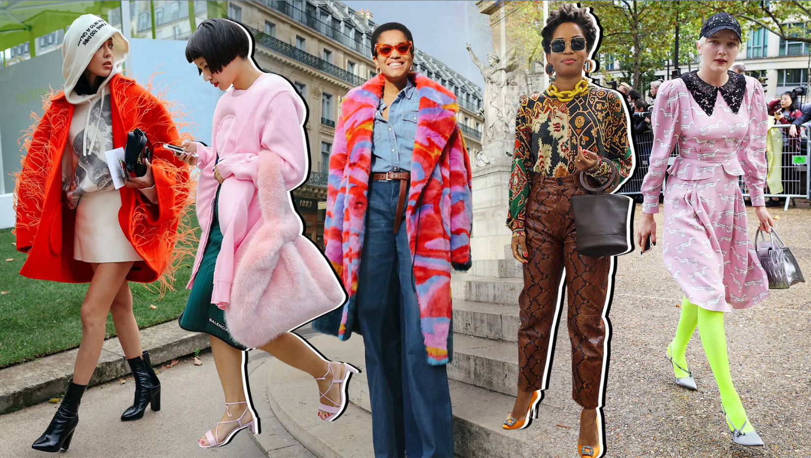
Maximalism #
At the same time, with every push, there is a pull. Maximalism uses colors and patterns to convey a sense of playfulness.
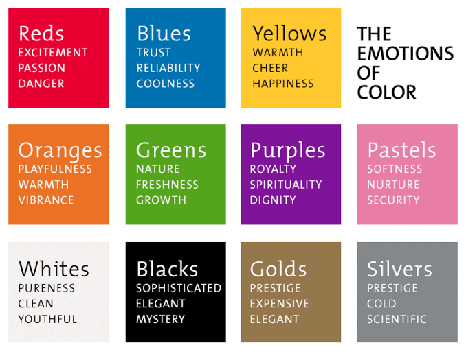
The Feelings Colors Invoke #
It’s also important to note that colors can invoke and emphasize different meanings. This doesn’t mean that a luxury brand’s logo has to be all gold, or that a children’s toy needs to be yellow for them to feel happy. It’s best to keep in mind more as a suggestion or inspiration. For example, you may not want to paint a nursing home or preschool red, but pastels, greens or yellow would be better.
These are not steadfast rules and are subjective, but it is important to keep in mind that colors have the power to influence mood.